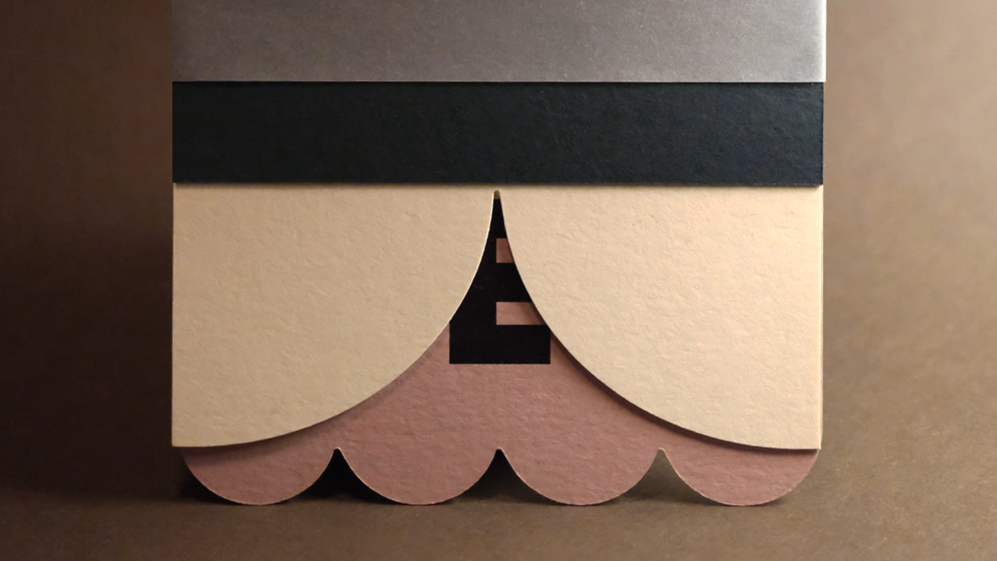
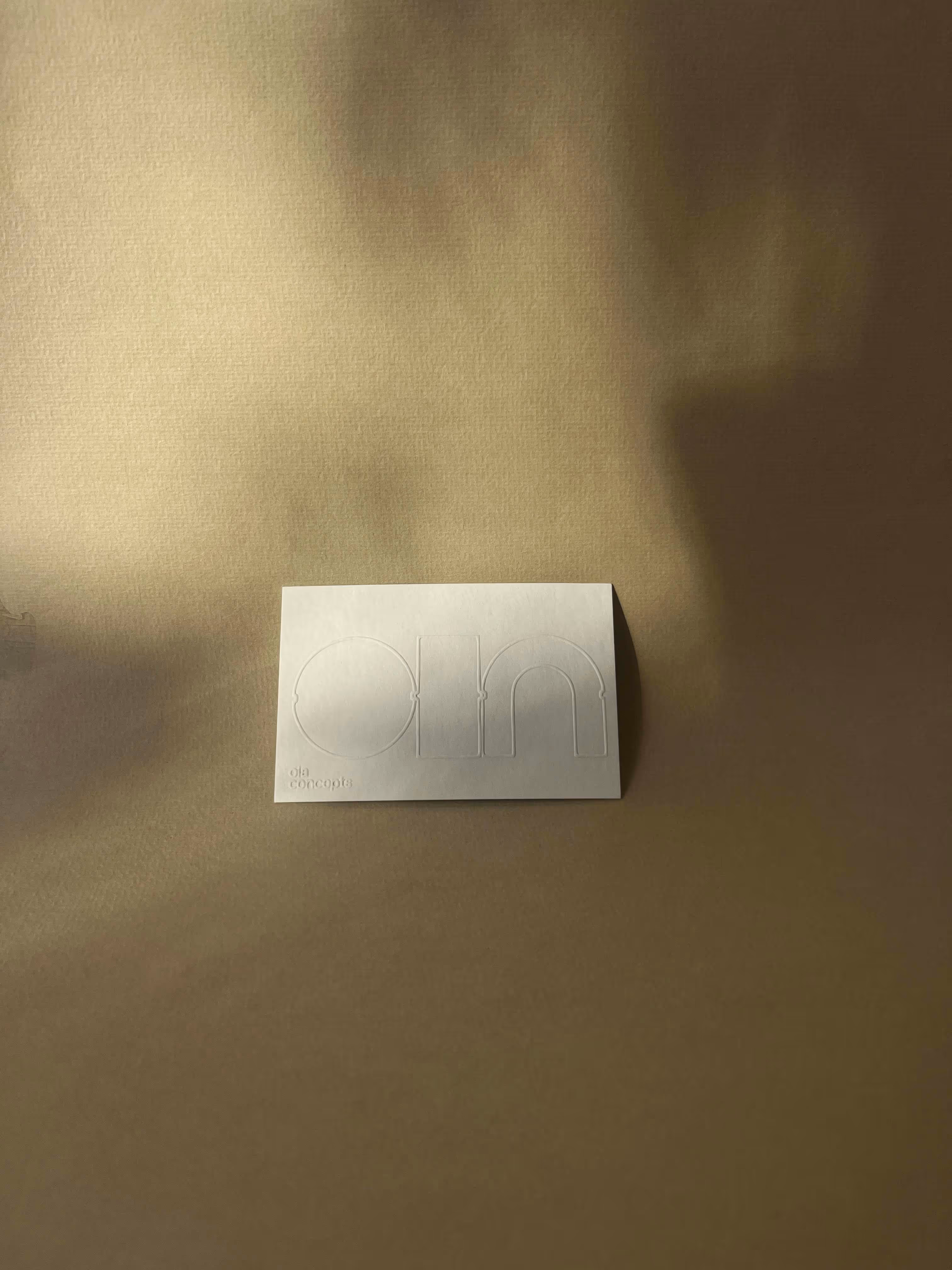
In the summer of 2024, I started working on the logo for OIA, built around the idea of ‘O’, ‘I’ and ‘A’ as modular elements. The OIA concepts logo is made up of different basic shapes, each individually referring to a letter: O (Object), I (Interior) and A (Architecture). These letters can stand on their own, but can also be brought together in new combinations. Small notches on the side of each letter allow the shapes to easily click or slide into one another, creating a modular logo system. The notches symbolize precision and attention to detail.
Logo for OIA concepts

Landing page
Animated logo
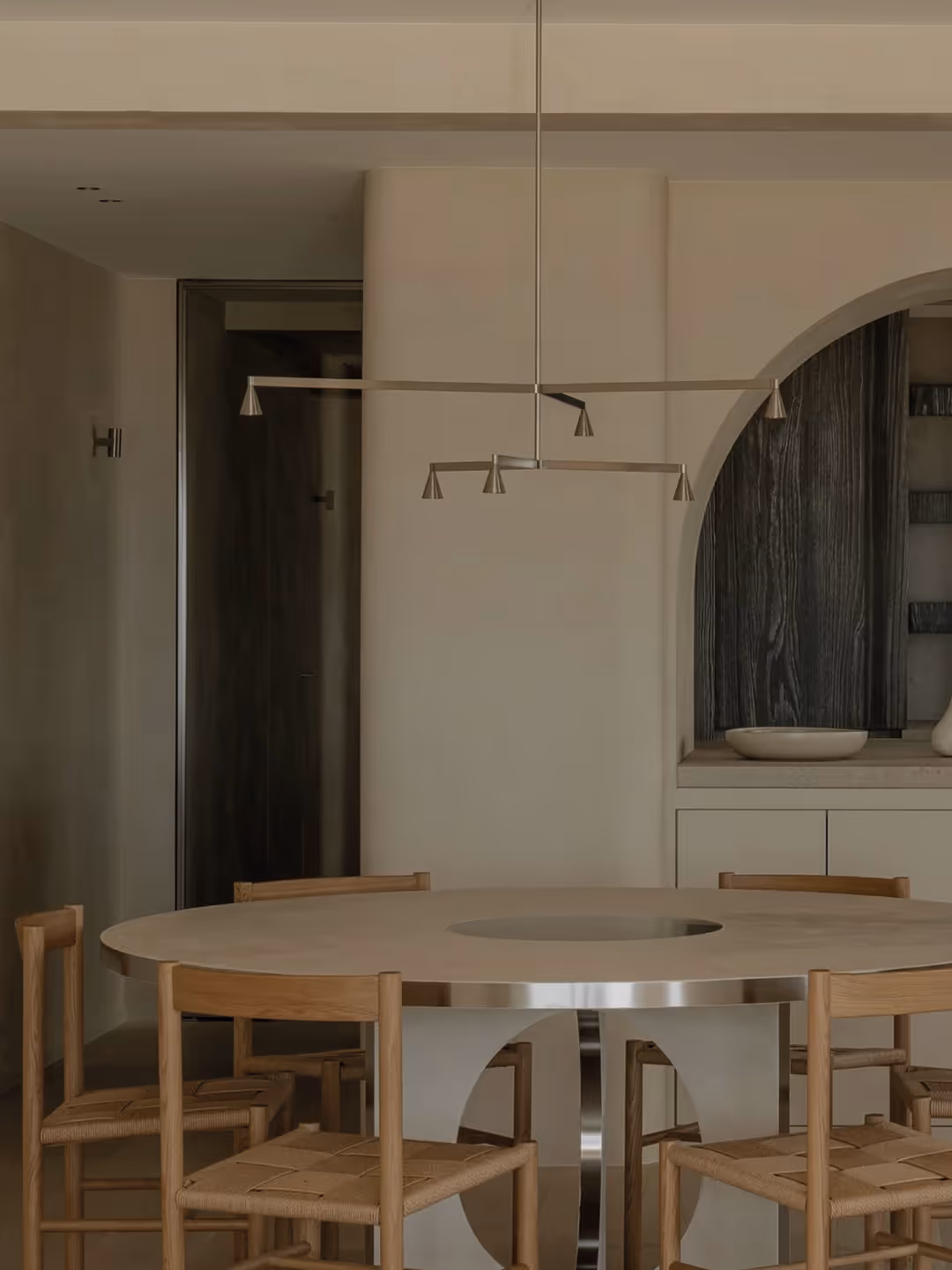
A minimalist home located
on the Belgian coast
designed by OIA concepts
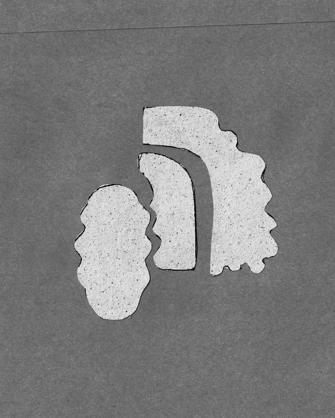
OIA logo study
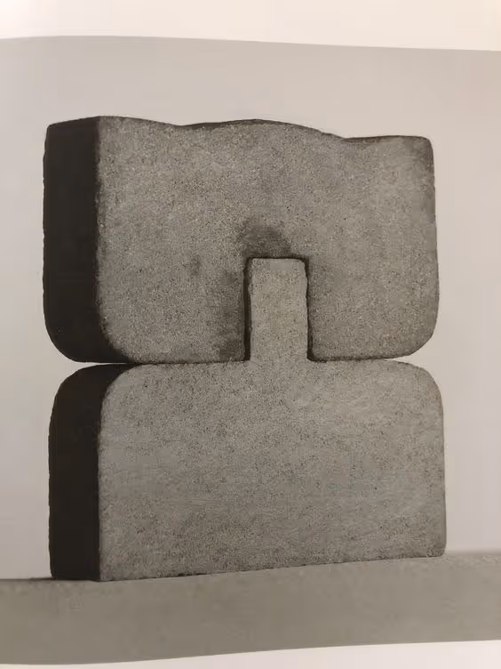
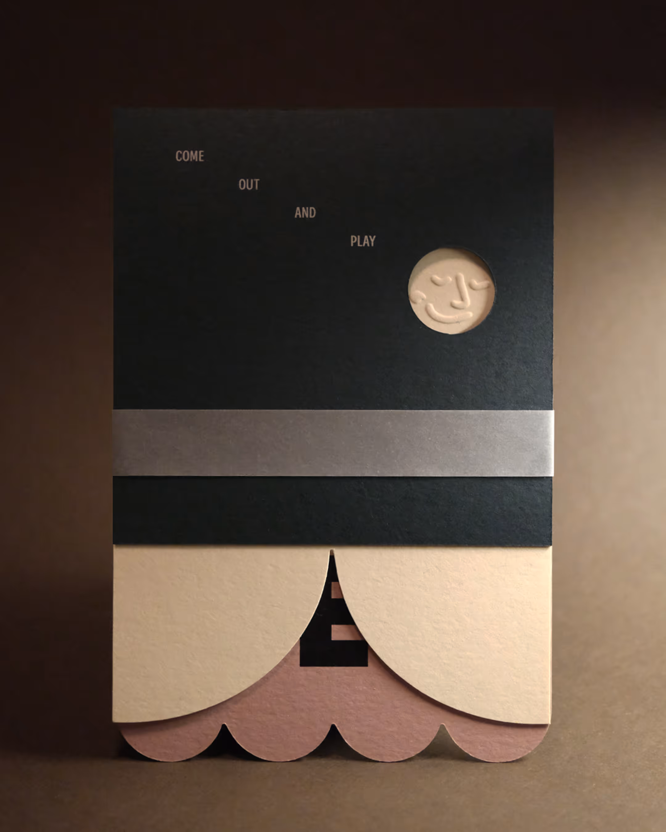
Mood
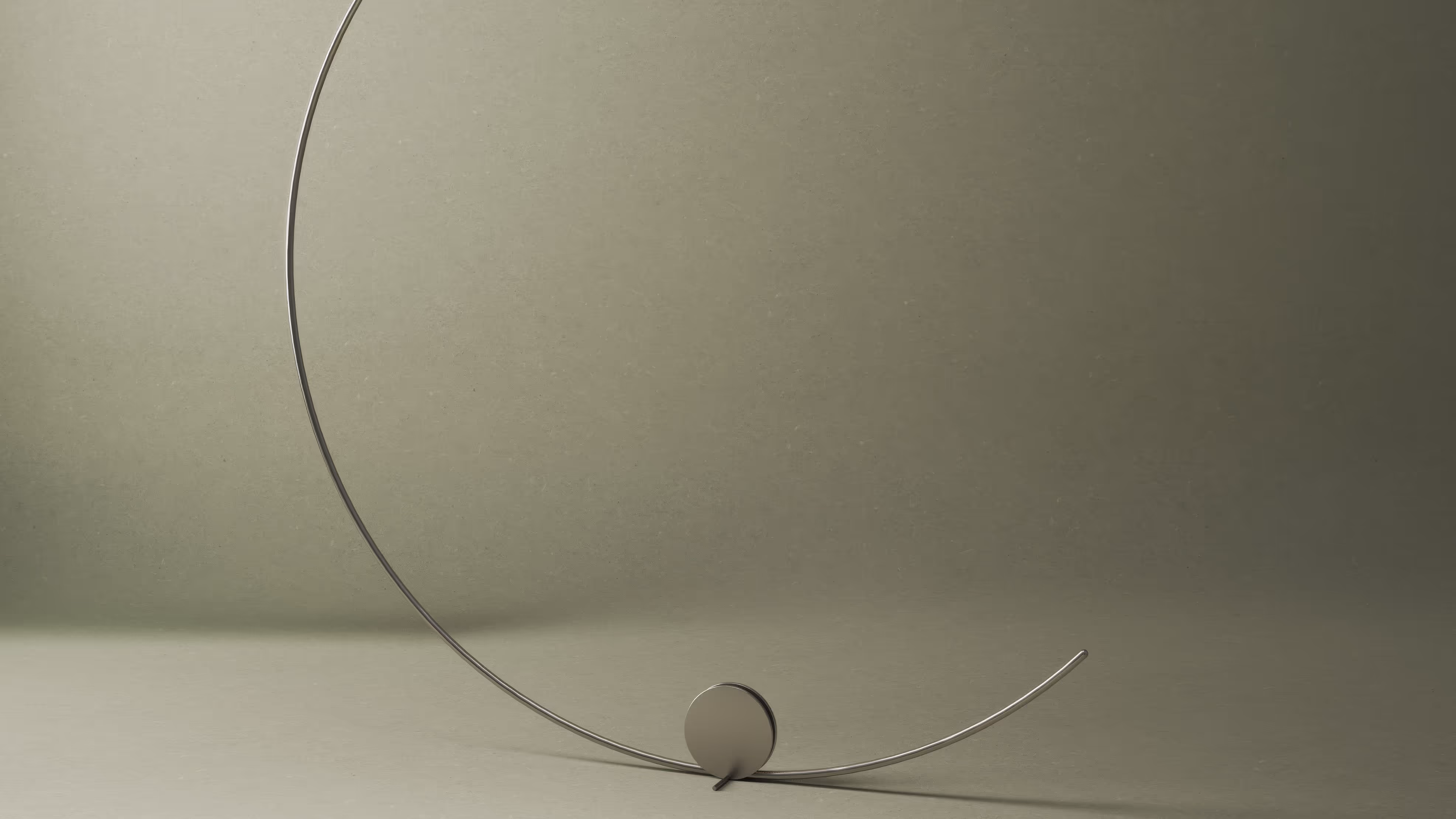
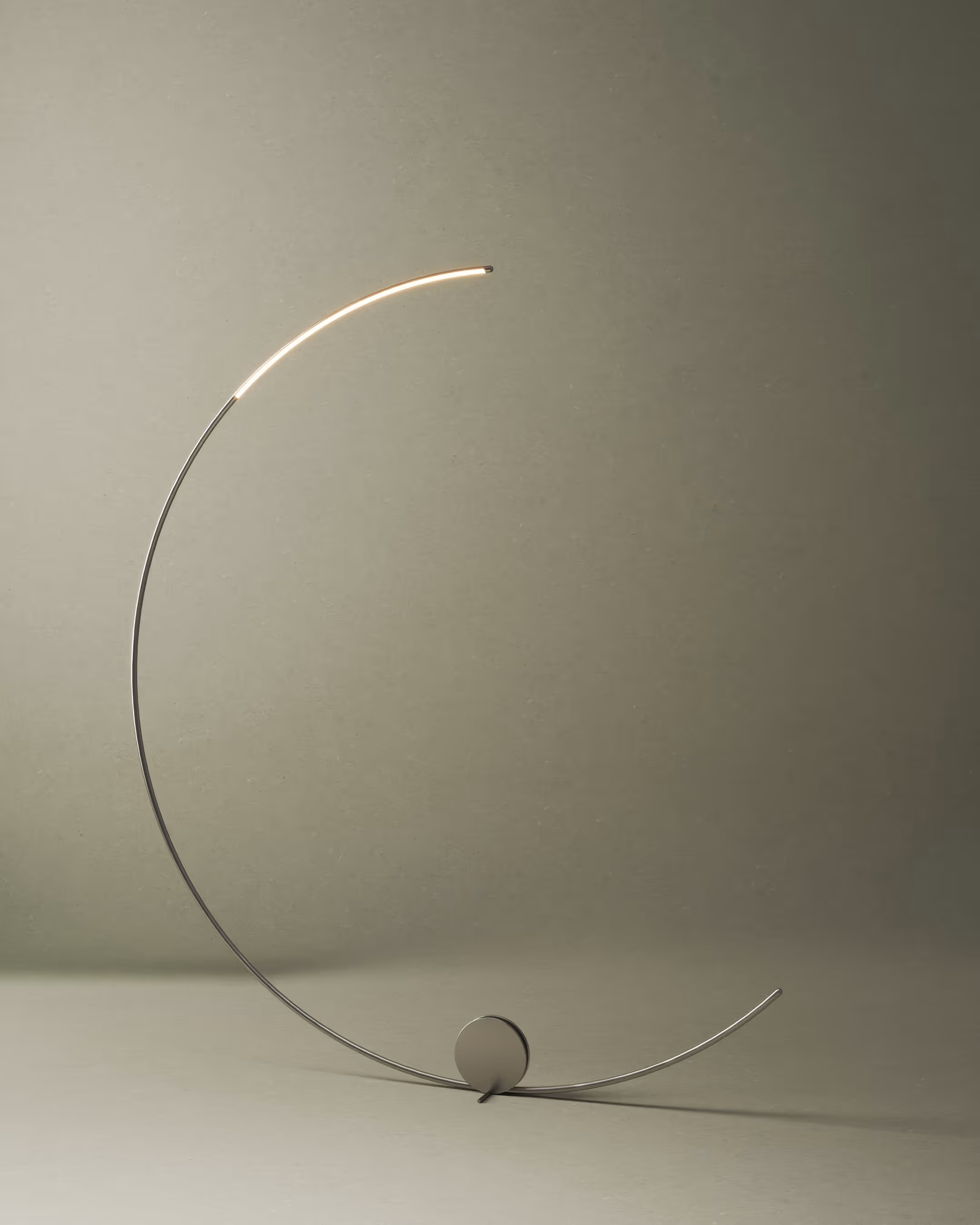
Sculpture by Eduardo Chillida
LOGO ANIMATION (D) by Vincent De Boeck, MADE FOR Oia Concepts