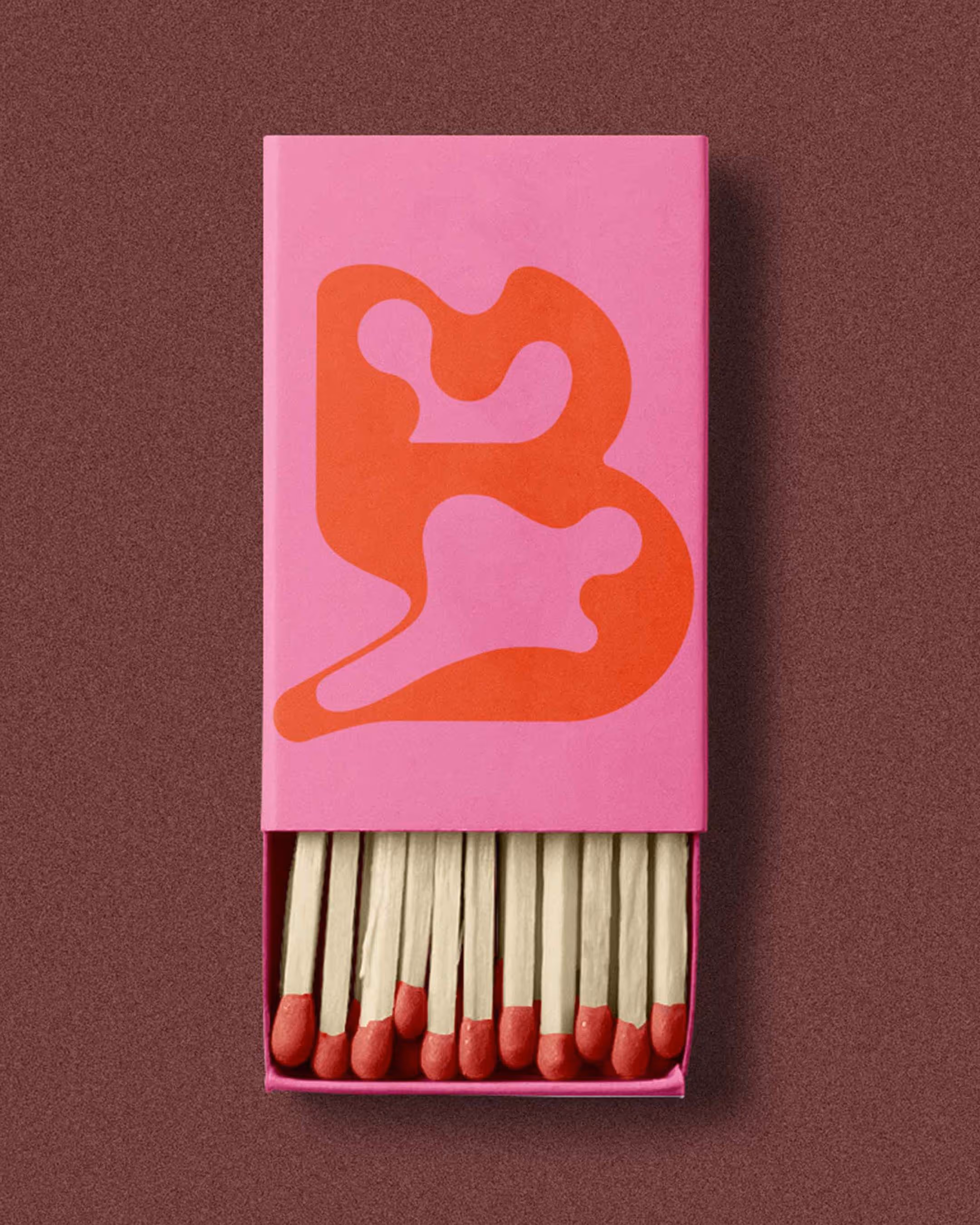
For the brand identity of Bouwstof, an interior design studio working with existing materials and authentic elements, I wanted to create a recognisable graphic symbol that adapts to its context. Just like the people behind Bouwstof, always searching for the most natural expression for every space and every project.
Textured logo version for bouwstof
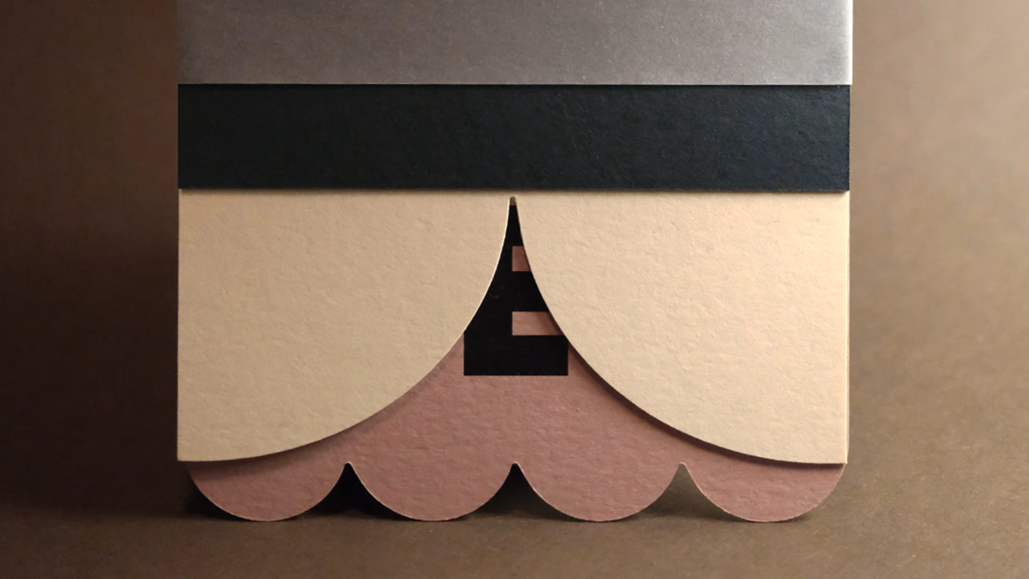
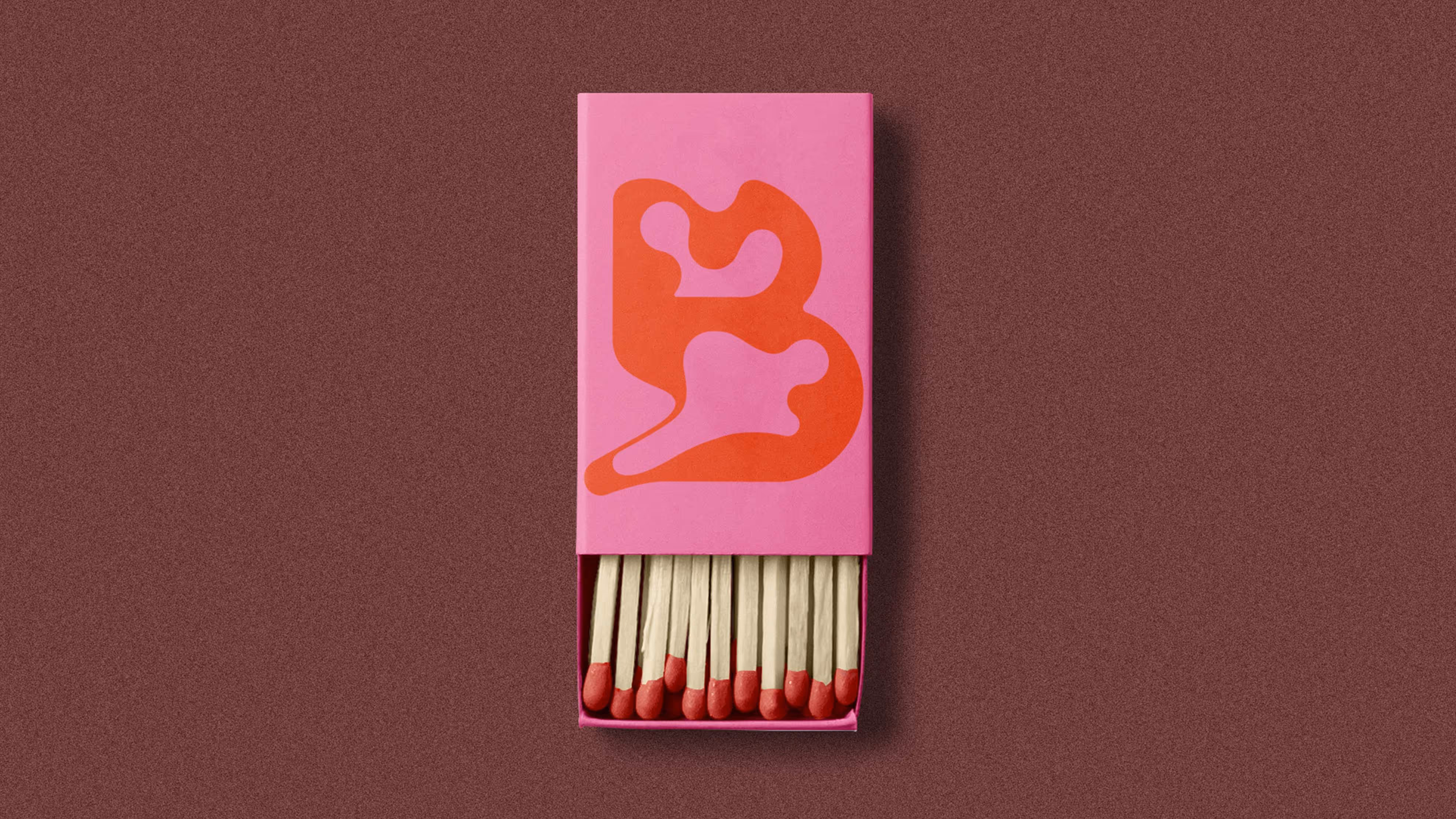
One b, many possibilities

A grid system in which
each graphic element finds
its place within the format.

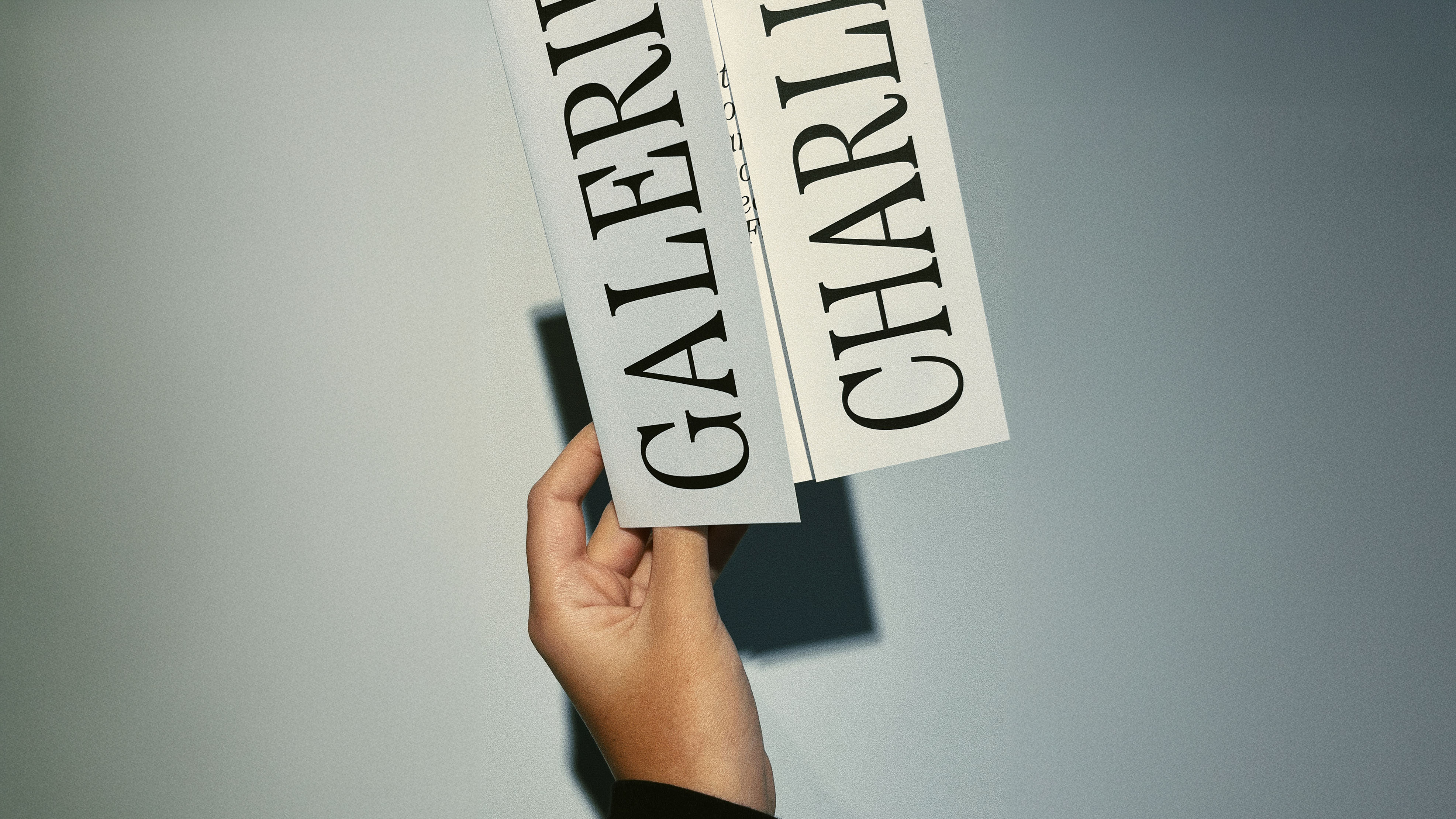
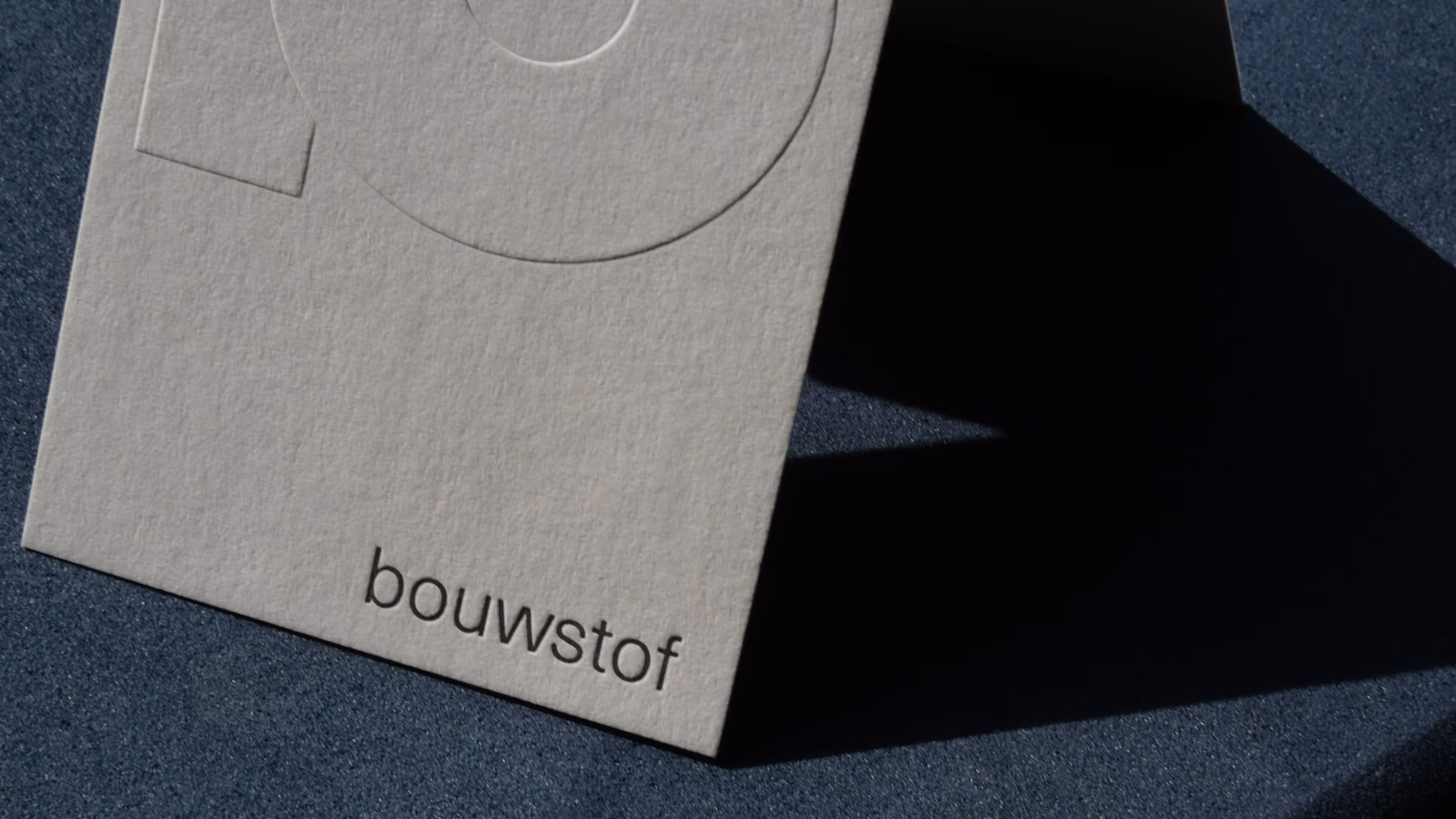
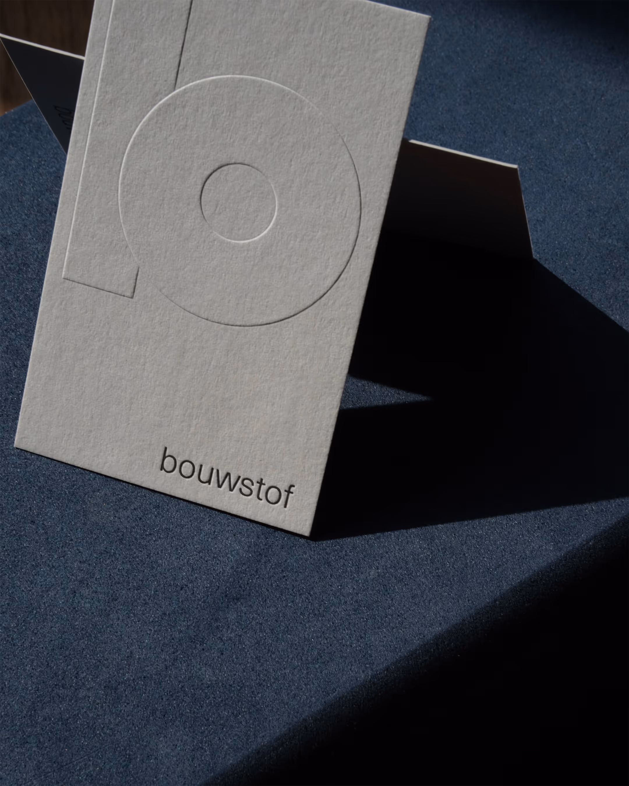
Business cards
printed by Jozias Boone
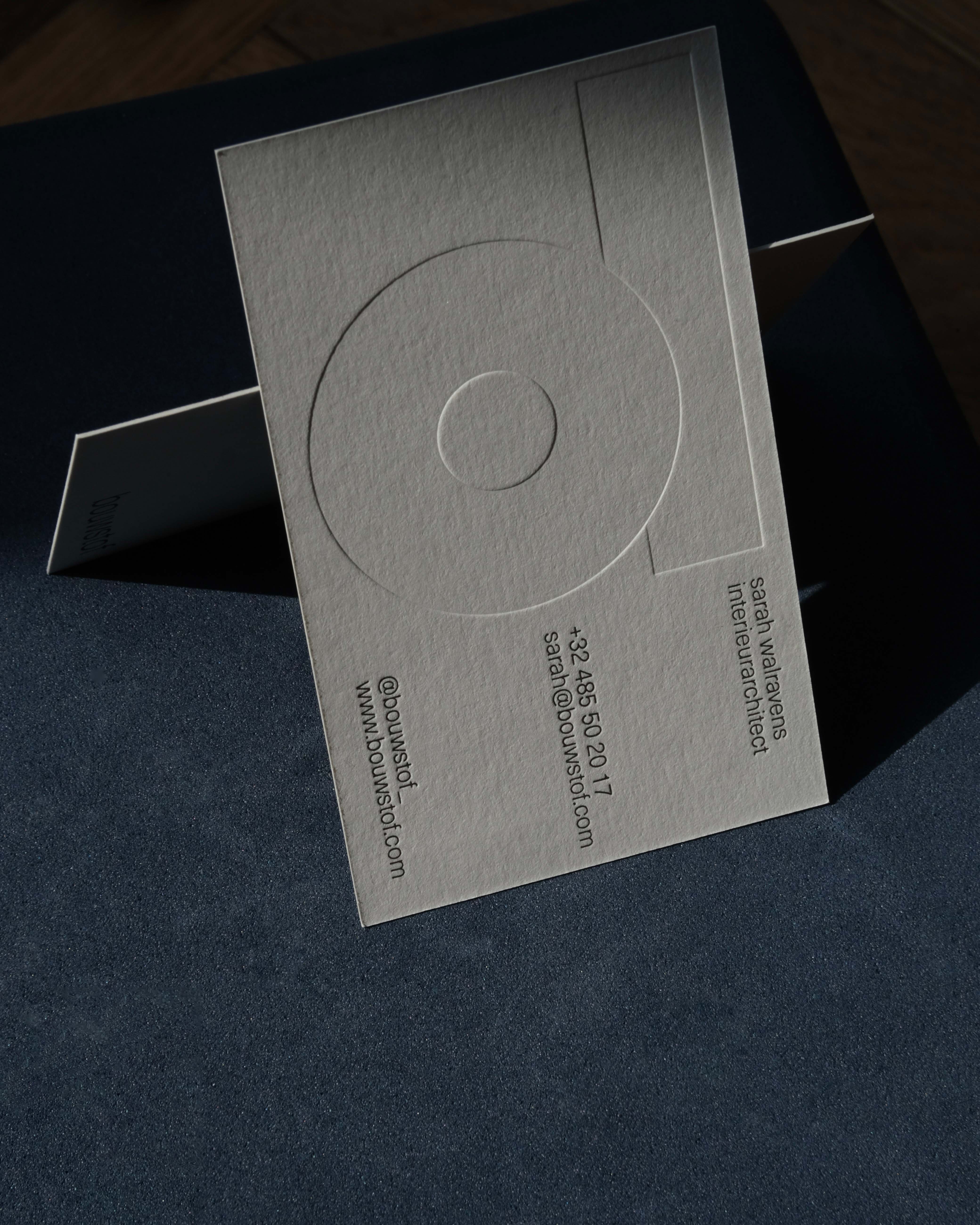
Business cards
printed by Jozias Boone
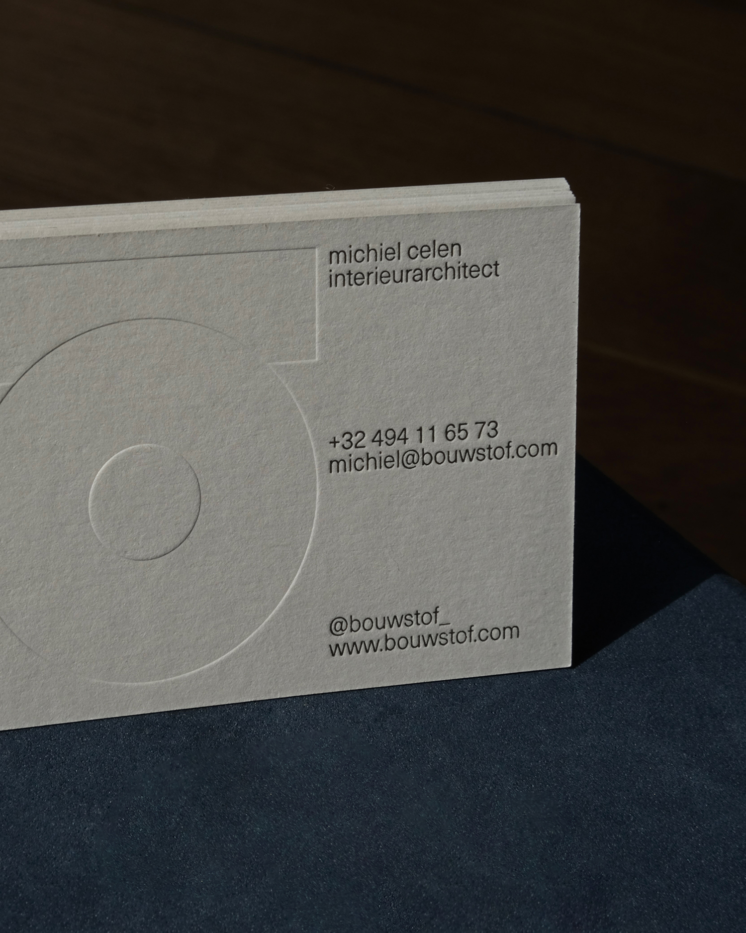
Business cards
printed by Jozias Boone
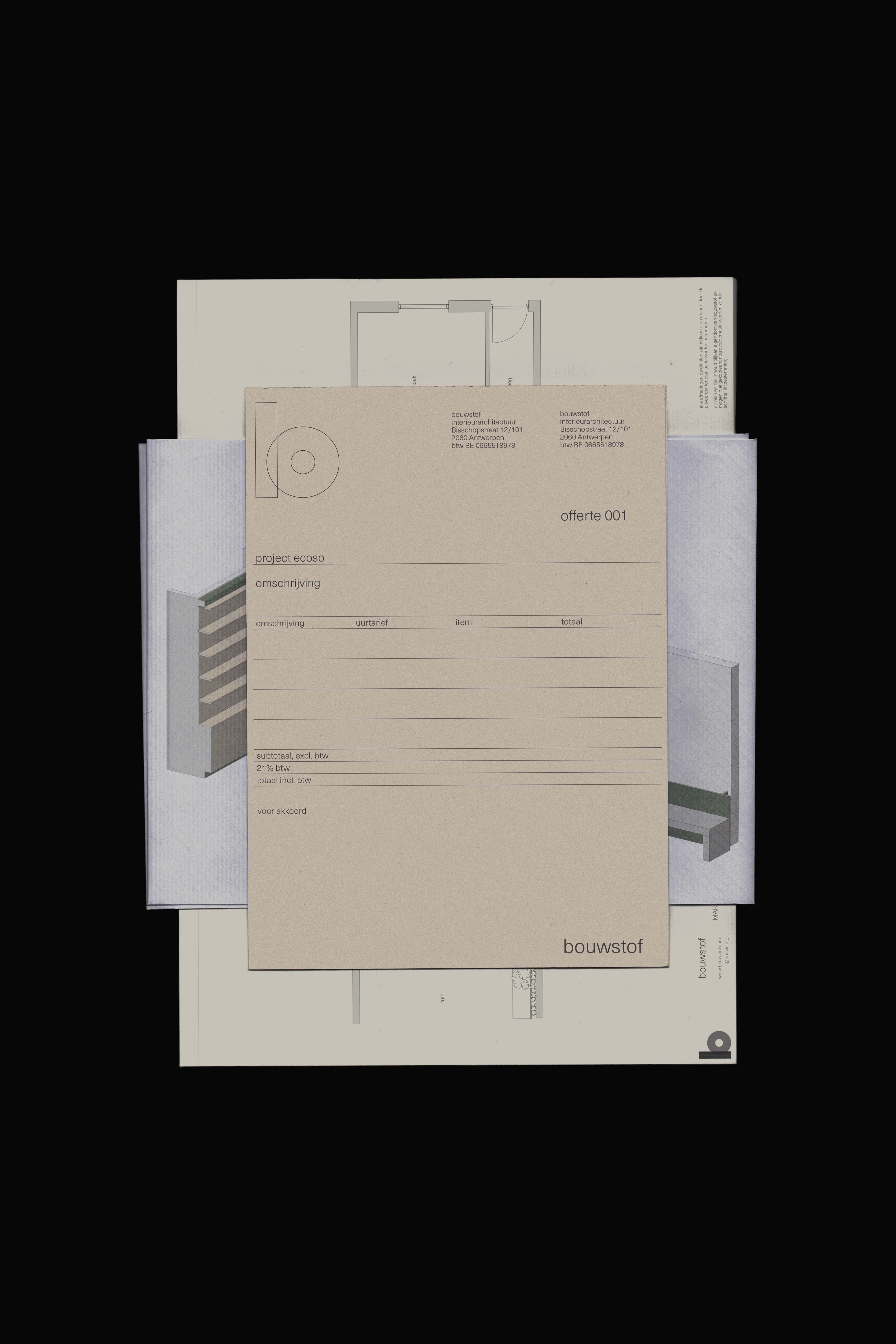
Quote, sketches and plans
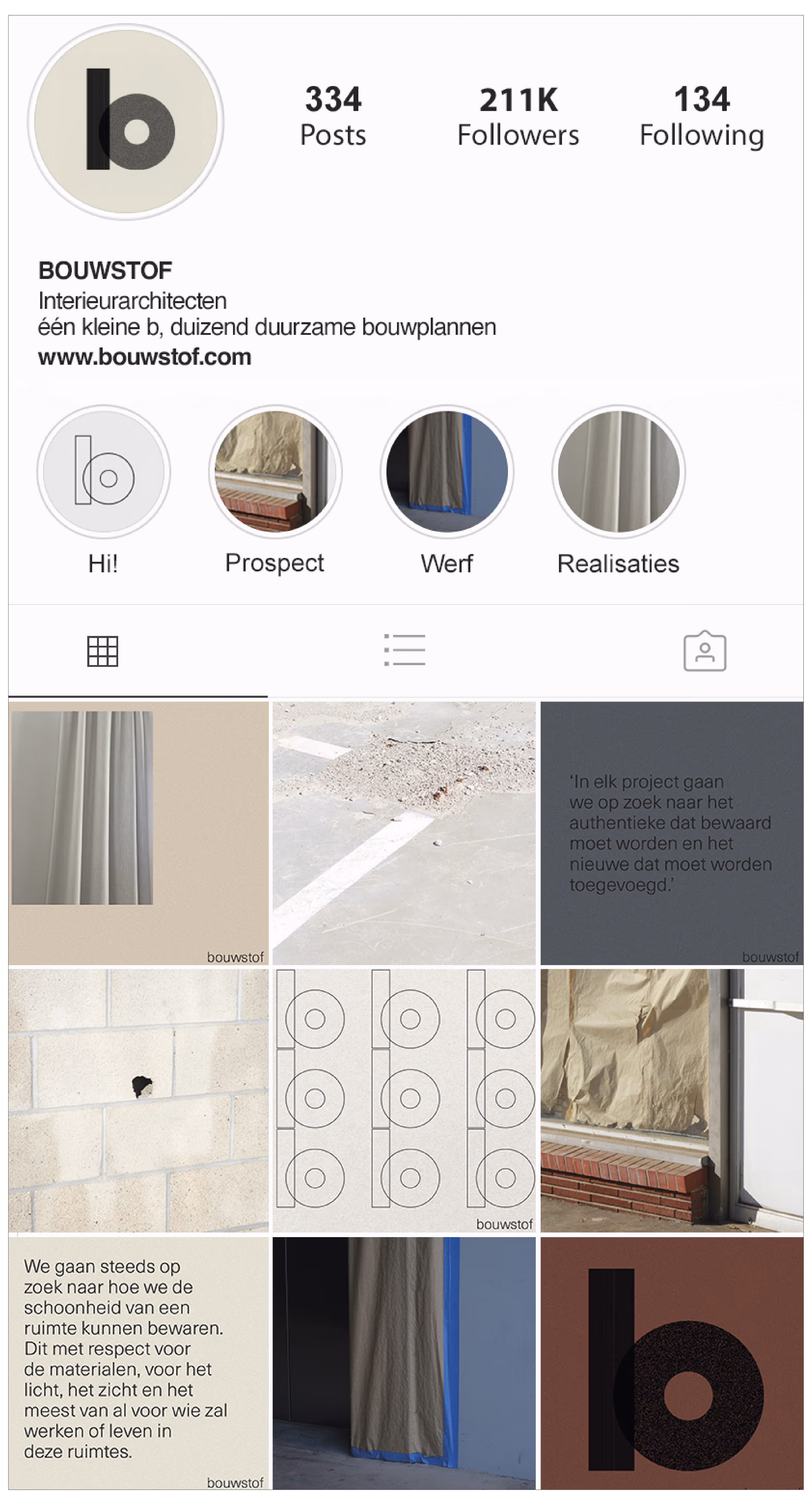
Instagram grid
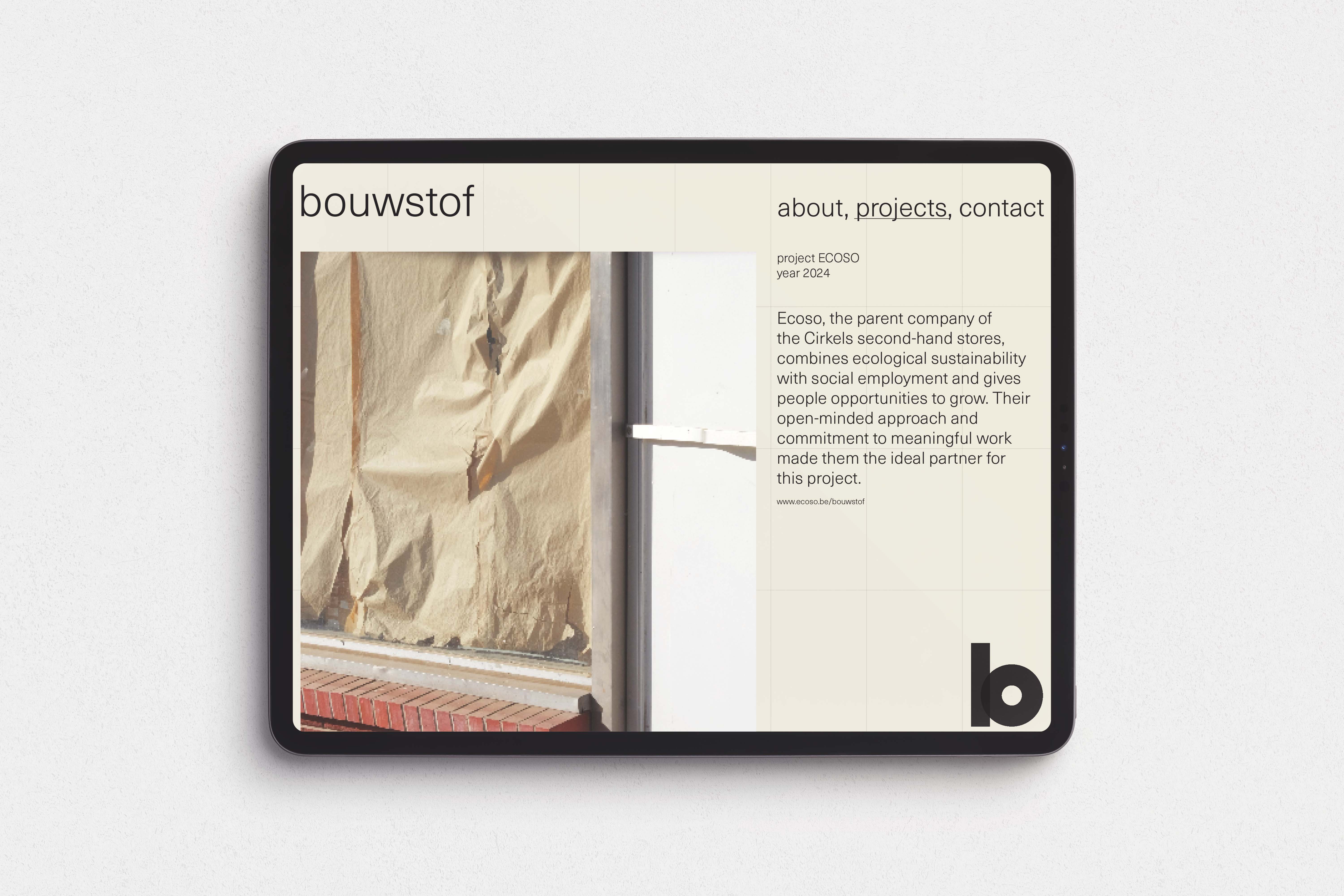
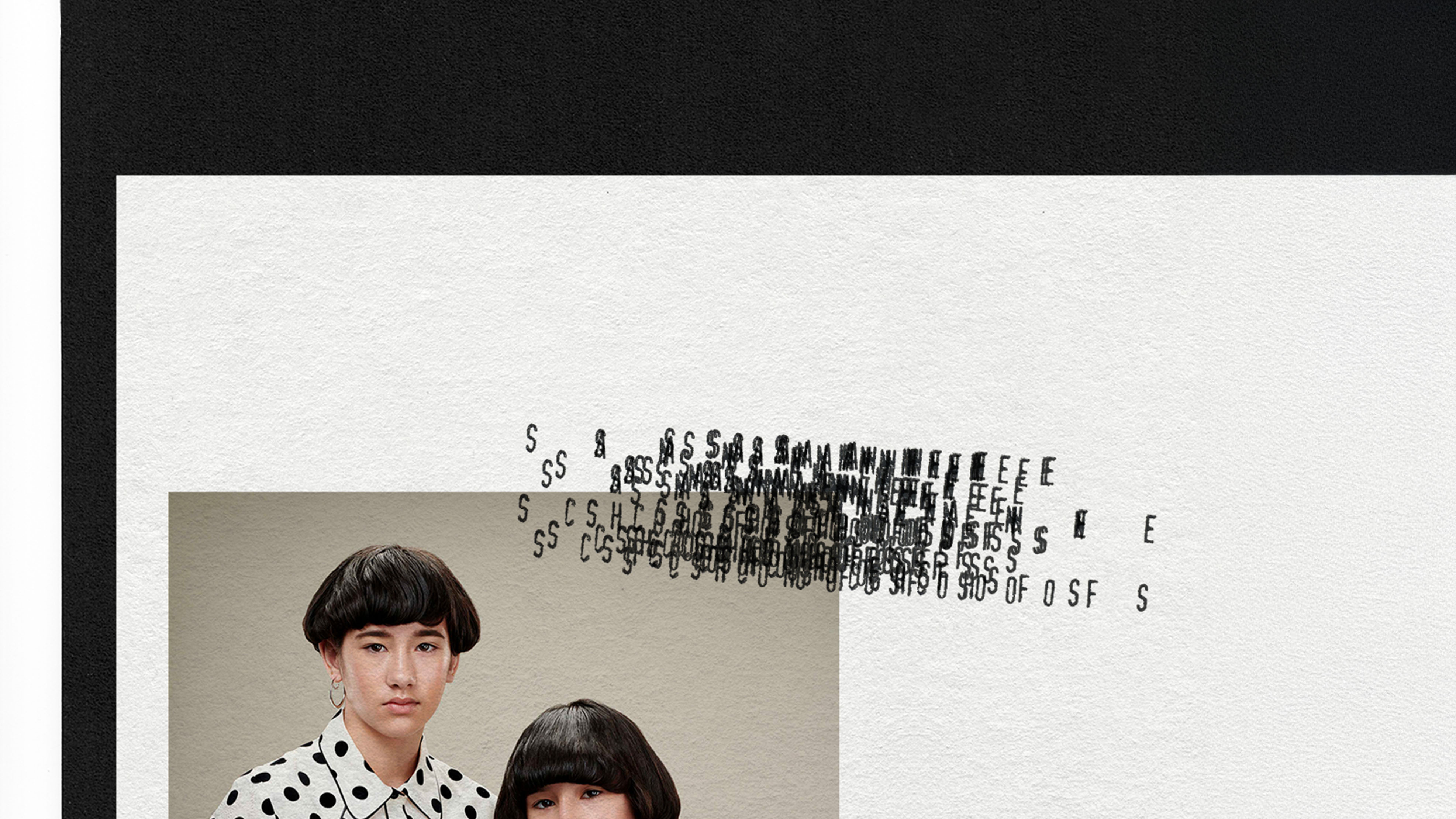
Concept for a website
project page
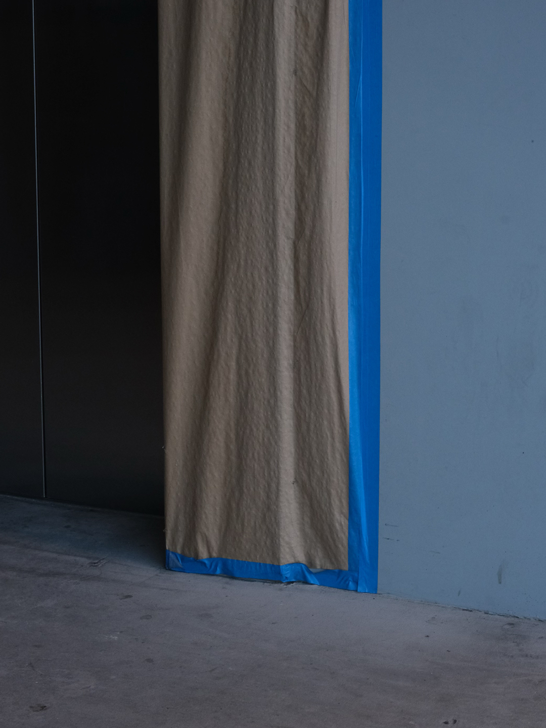
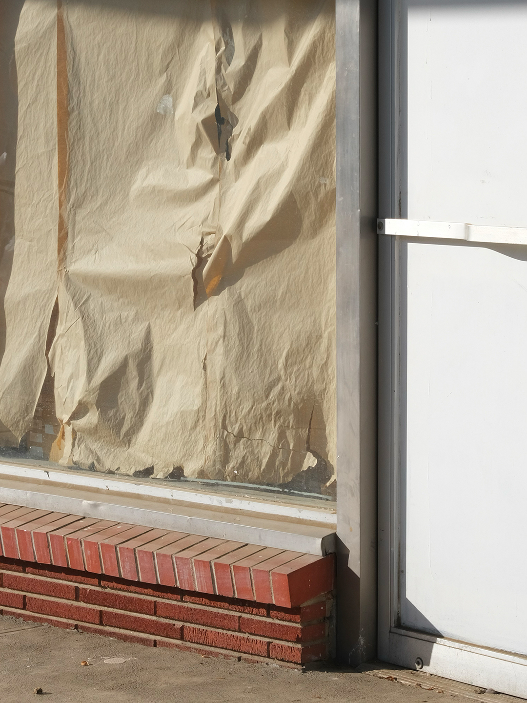
The photography focuses on close-up details of materials,
textures and spaces, captured in natural light.
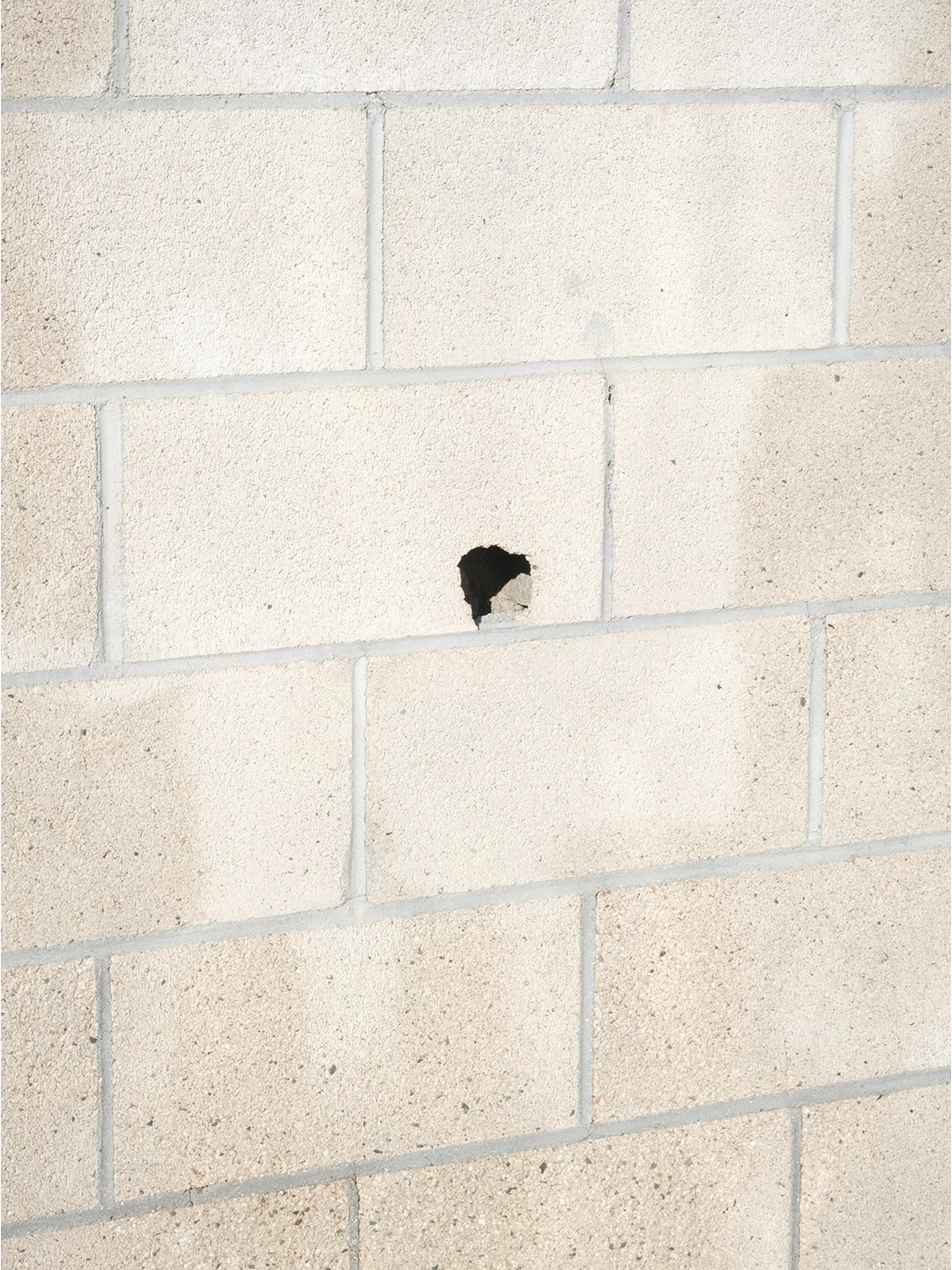
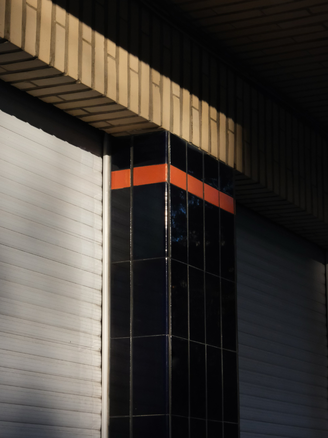
PHOTOGRAPHY by Thomas Driesen, MADE FOR Bouwstof